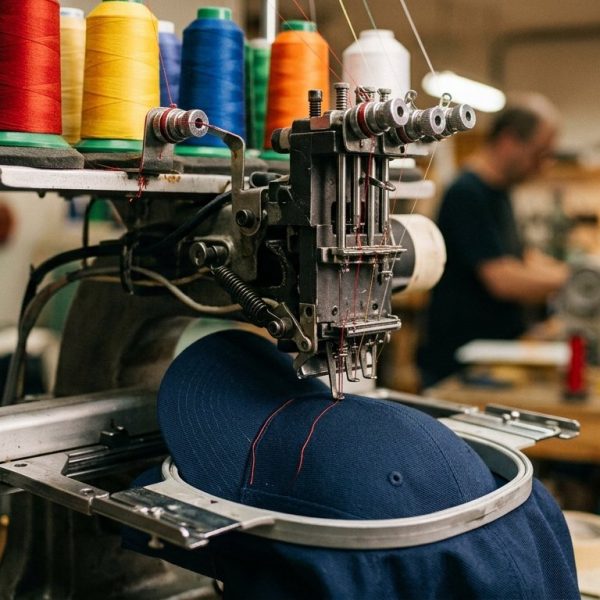
Custom Embroidered Hats: What Separates the Good Ones From Rack Fillers
- September 18, 2026
- English Article , custom embroidered hats
Two custom embroidered hats can come off the same machine in the same week with the same logo, and one of them will still look like a giveaway from a trade stand. The difference is almost never the artwork. It is settled in a handful of decisions made before a single stitch goes in, and most buyers never hear about any of them.
If you have ever pulled a cap out of a box and felt your enthusiasm quietly drain away, this is the explanation. None of it is complicated. It is just invisible from the product page.
Stitch count is not the number you think it is
Suppliers quote stitch count because it is easy to measure and it correlates loosely with price. It correlates much more loosely with quality. A badly planned four thousand stitch design will look worse than a well planned eight thousand stitch one, and it will feel worse too, because stitches crammed into a small area stiffen the fabric into a plate.
What matters is density and underlay, the hidden foundation stitches laid down before the visible ones. Skip the underlay and the top stitching sinks into the fabric, letting the cap colour show through in gaps. Overdo the density and you get a rigid slab that refuses to curve with the crown. Neither problem shows up in a digital mockup, which is why mockups sell so many disappointing hats.
Embroidery vs screen printing, and when each one wins
The instinct is that embroidery is premium and printing is budget. True often enough to be misleading. Embroidery wins on durability, on texture, and on anything worn hard or washed weekly. It is the right answer for caps, polos, workwear and outerwear.
Printing wins on detail and on colour. Photographic images, fine gradients, tiny serif type and anything with more than about eight colours will look better printed and frankly cheaper printed. Thread cannot render a soft gradient, and forcing it to try produces the muddy stepped effect you see on discount merchandise. The practical rule is that if your logo survives being reduced to solid shapes, it will embroider well. If it does not, change the technique rather than the expectations.
The crown, the buckram and why cheap caps pucker
Inside the front panel of a structured cap sits a stiffener called buckram. It is the reason the panel stands up, and it is the first thing a factory economises on. Thin buckram plus dense stitching equals puckering, that wavy distortion around the logo that no amount of steaming fixes.
Unstructured caps dodge the problem by having nothing to distort, which is part of why they have taken over so much of the market, but they demand lighter designs. Machine embroidery has a long industrial history and the physics have not changed: thread pulls fabric inward, and something has to resist that pull.
Embroidered trucker hats sit awkwardly in the middle here. The foam front holds a design beautifully and the mesh back keeps the thing wearable in July, but foam needs its own digitizing approach and a supplier who has not done it before will hand you something that looks quilted.
What separates good custom embroidered hats from rack fillers is usually the discipline applied before a single stitch is sewn: a clean mark, sensible sizing, and colours that survive the material. The same discipline decides whether a brand looks considered or improvised once its artwork moves onto a screen. Strong social media design applies those merchandise rules to feeds and stories, where a crowded logo fails just as visibly as it does on a poorly digitised cap.
Embroidered patches for hats solve a problem stitching cannot
When a design has too much detail, too many colours, or needs to sit across a seam, a patch is not a compromise. It is the correct tool. The patch is produced flat, where the machine has complete control, then applied to the cap.
Leather and faux leather patches have become the default for outdoor and heritage brands, and woven patches handle fine detail that thread on a curved crown never could. The tradeoff is attachment: heat pressed patches fail eventually, stitched ones do not, and any supplier quoting patches without telling you which method they use is telling you something.
What to send your supplier, and what to ask for back
Send vector artwork. Not a PNG pulled off your own website, not a screenshot. The factory will digitize it, meaning convert it into a stitch path, and that conversion is a skilled job that some suppliers outsource to whoever is cheapest that month.
Ask for a physical sample on the actual cap you ordered, in the actual thread colours, before the full run. Ask what thread they use. Ask whether the digitizing file belongs to you, because if you switch suppliers later and it does not, you are paying for that work twice. These questions take four minutes and they separate the suppliers who will get it right from the ones who will apologise afterwards.
Quality claims are cheap, so check the ones that are checkable
Merchandise marketing leans hard on words like premium, heavyweight and artisan, none of which mean anything measurable. The same credibility problem has already played out in clothing more broadly, which is worth reading about in the context of what is sustainable fashion and why shoppers stopped believing the label.
Check the numbers instead. Fabric weight in grams per square metre. Thread type. Whether the cap is washed or unwashed cotton. Whether the closure is a proper metal buckle or a plastic snap that will crack. Enthusiasts pick these details apart constantly in places like r/Embroidery, and an hour reading there is worth more than any brand's own copy.
And if you sell into more than one country, remember that your product descriptions are doing the persuading in a language you may not speak. PoliLingua makes the case well for localized product descriptions, and on technical apparel details the cost of a vague translation is a return.